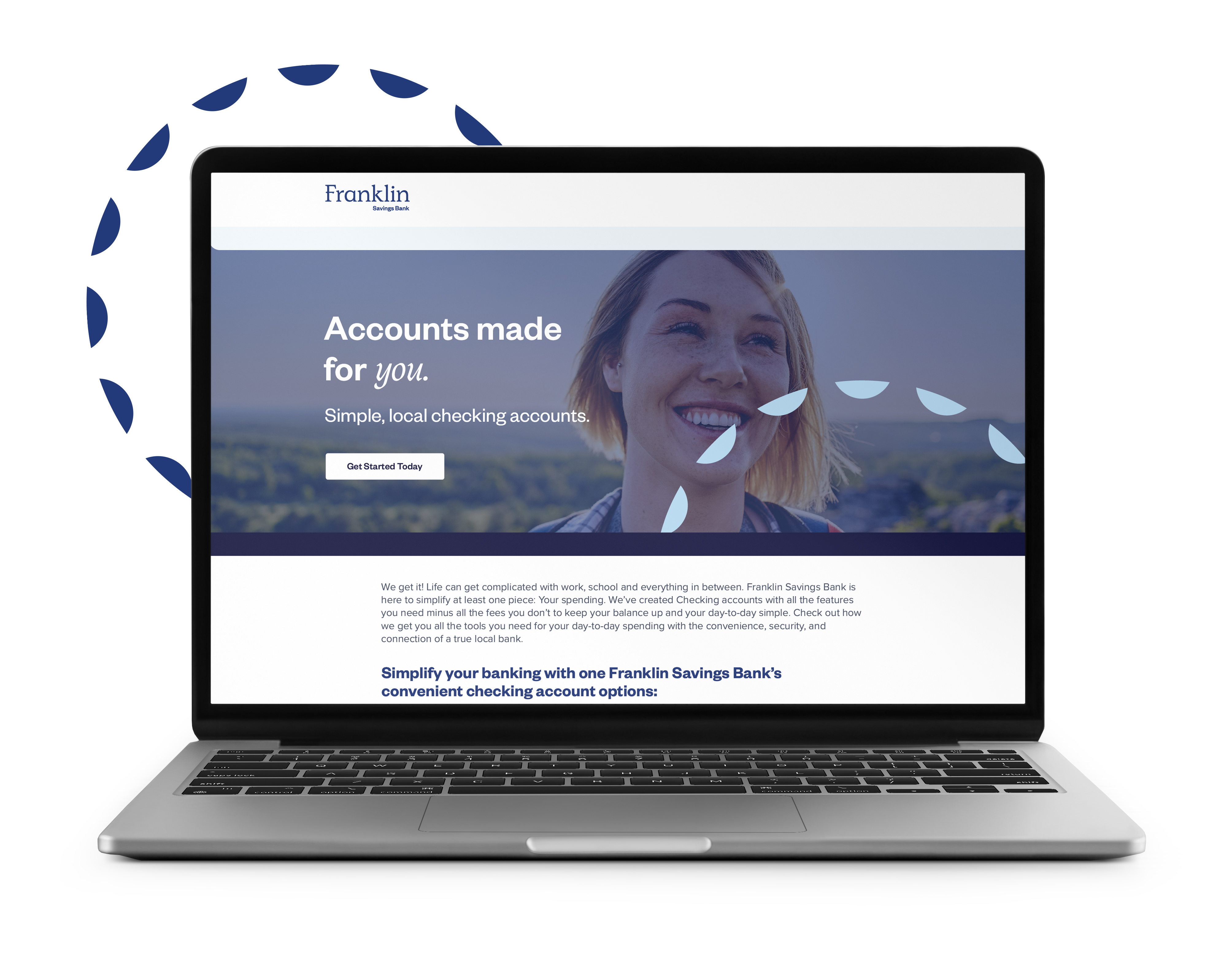
Our first step was to reverse-engineer a campaign by designing a new landing page for the bank’s two checking accounts. Driving traffic to a landing page versus a web page makes it easier to manage content, track the user journey and employ dynamic design elements.
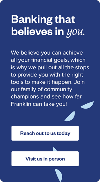
Each line of copy spoke directly to Mainers’ busy, adventurous lives, reassuring them that a better checking account would mean less time worrying about finances and more time soaking up the natural beauty of Maine.
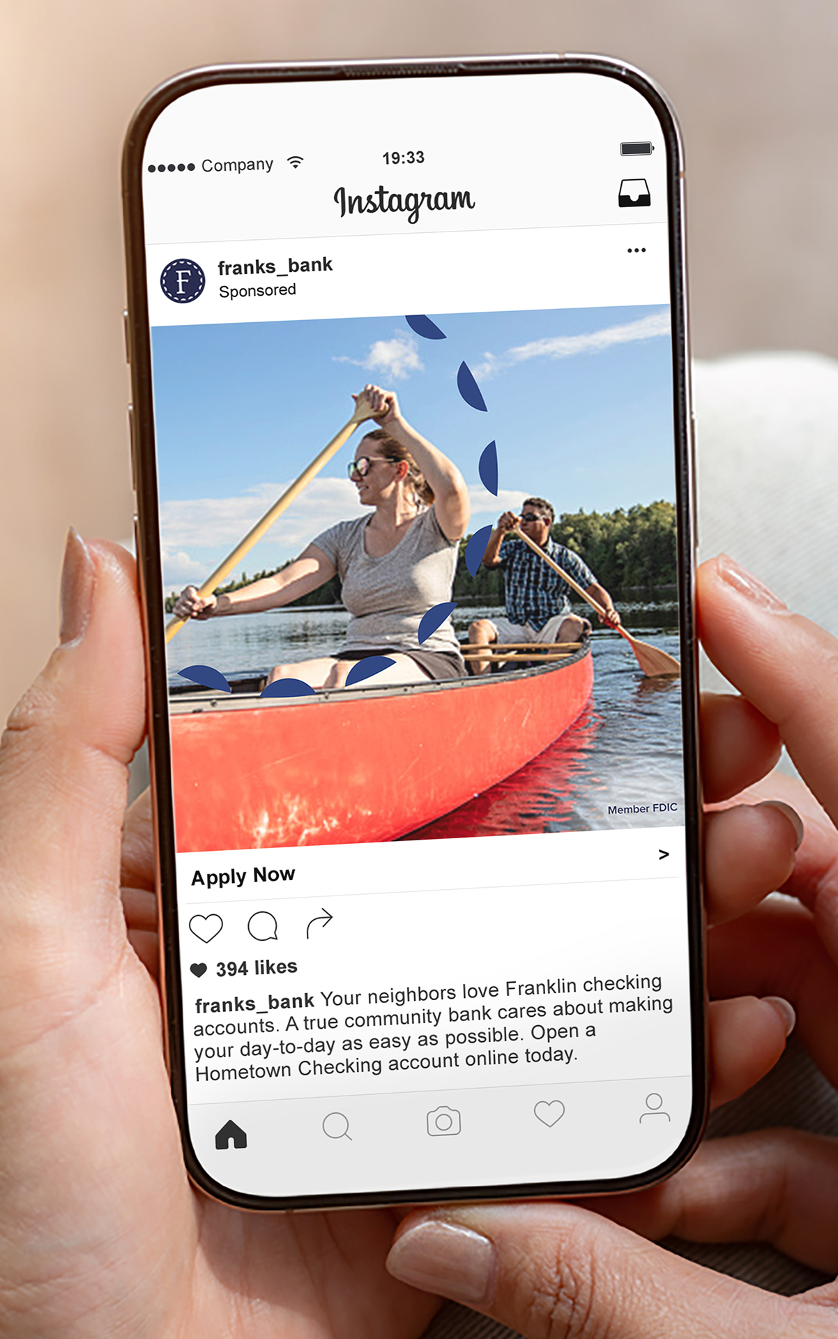
Design elements like a palette of serene blue hues, outdoorsy images, and a bright wheel icon emphasized the relaxed vibes of working with Franklin Savings Bank. (Market research note: Such images resonate with the way Mainers see their lives.) The social, digital, and print ads followed, using the same Maine-centric headlines and nature-oriented designs. Each campaign image was hand-picked to fit the area's unique seasons. Once the weather began to change, the Pannos team was quick to update images to reflect the new season.