Texans Credit Union

Brand 
Refresh

Services on this project:
  • Brand Strategy
  • Design
  • Copywriting

Process details

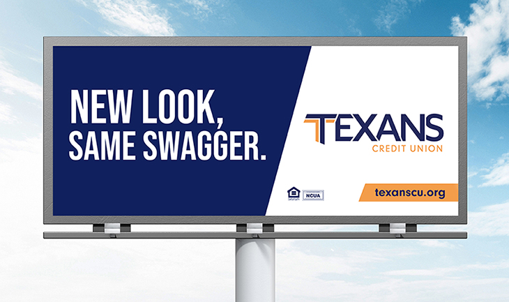
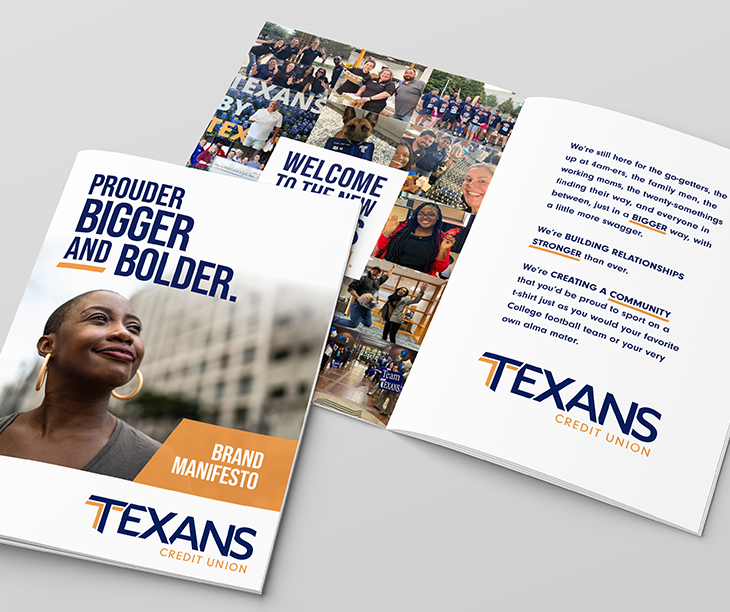
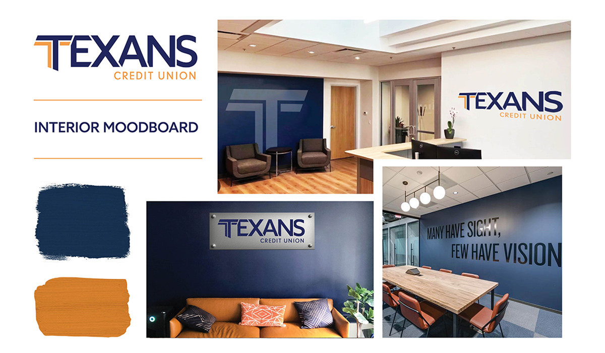
Every element of the brand was transformed. A new logo. A new brand voice and messaging platform. Cohesive, holistic visual brand standards. All in the service of putting a best face forward to the credit union's communities, including current and future members.

The messaging of the brand embodies Texans itself: plain-spoken, honest, fair, and helpful. Nothing shallow or showy, just an earnest, friendly promise to do their level best on behalf of every member.

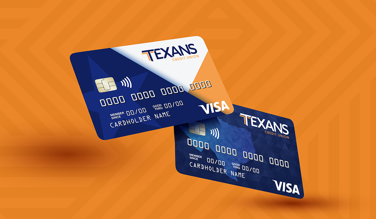
The design team went far beyond “crossing their Ts.” From explorations of fonts, type weights, angles, and color combinations, a new, iconic expression of the Texans identity emerged. Once the credit union approved the new logo, we worked to ensure the new brand standards would hold up across a range of media.

Next, we applied these newly minted brand standards to the Texans website, giving it a modern but warm feel, an assurance that the latest technology is always supported by friendly, helpful Texans.

And to ensure everyone at Texans was onboard, we created a video introduction to the brand for employees. It kept them included in the process and got them excited to be part of the new, modern identity for the place they’re so proud of.

Assets
$2.6 Billion
Membership
OVER 150,000
Established in
1953
Locations
14 Branches

GET IN TOUCH

(or stay in touch)