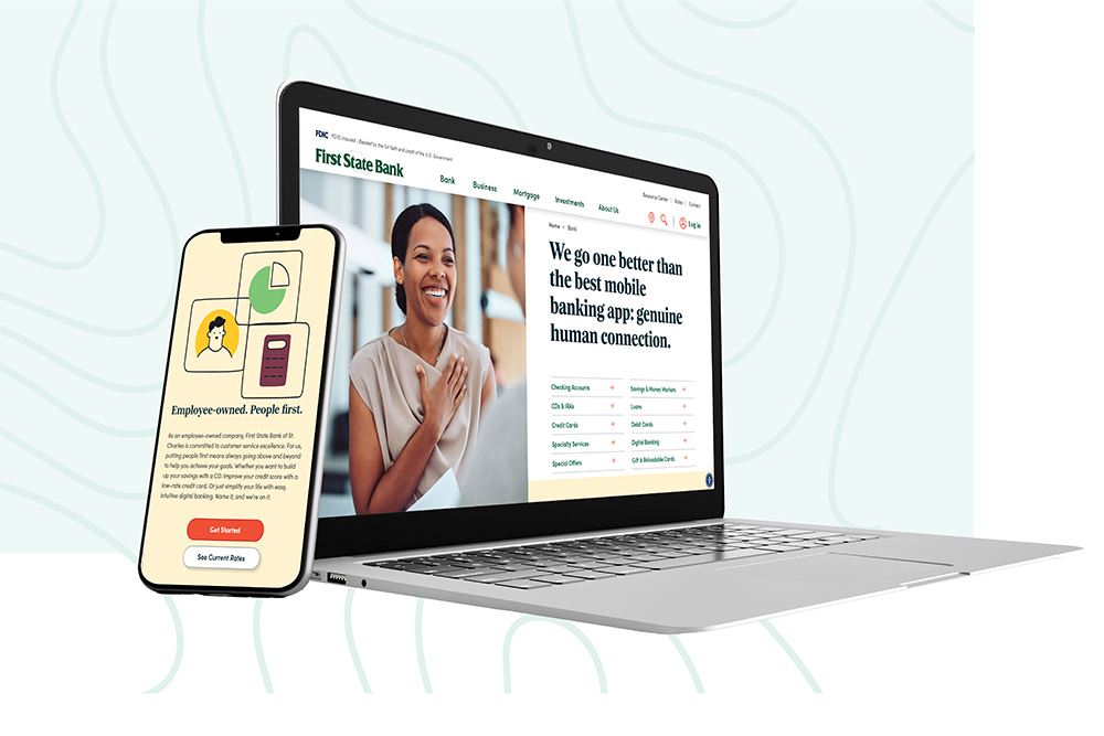
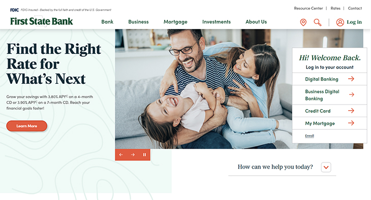
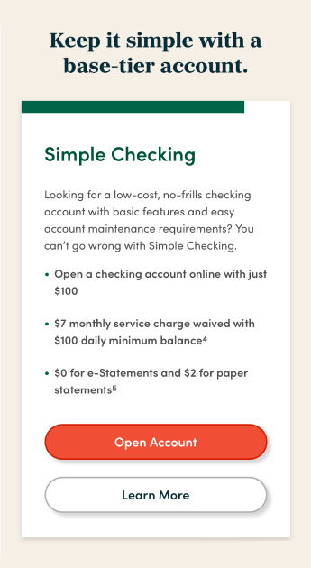
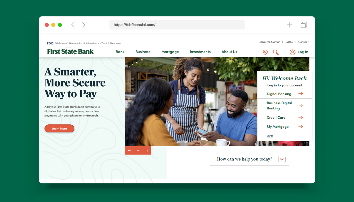
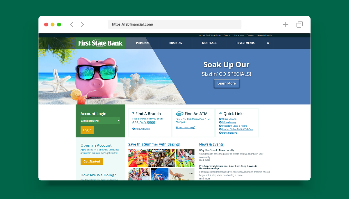
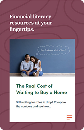
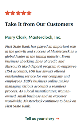
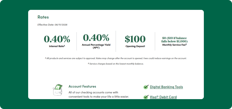
After an audit of the old site, the bank began to provide the web team with inspiration from across the internet. From huge navigations to several bright color palettes, and flashy iconography, their examples gave us all the inspiration we needed — and then some. The list of decisions to make was long. The teams worked together to dial in on the bank’s top priorities for their site. With branding always top of mind, Pannos emphasized that design selections should not only look appealing to their customers but make sense with the brand image the bank was creating.
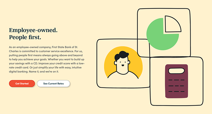
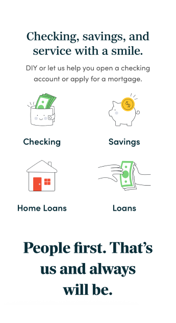
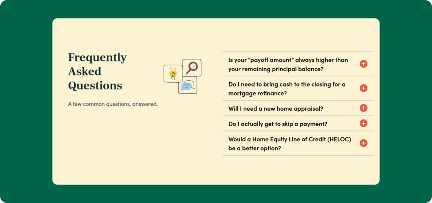
The Pannos team noted that along with a design utilizing lots of negative space, a robust mortgage section, unique iconography, and mega menu were among the most important aspects for the new website. We untangled a web of big ideas to create a website outline perfectly fit for this ambitious Missouri bank.