Peoples Bank has had the same deep commitment to customer service and relationships since they opened in 1910. Today, in a more complex world, the bank wanted to take a fresh approach to its outward identity, one that would reflect the forward-thinking embrace of today’s customer needs and the technology available to meet those needs.
Services used on this project
- Branding
- Design
- Copywriting
Project Goals
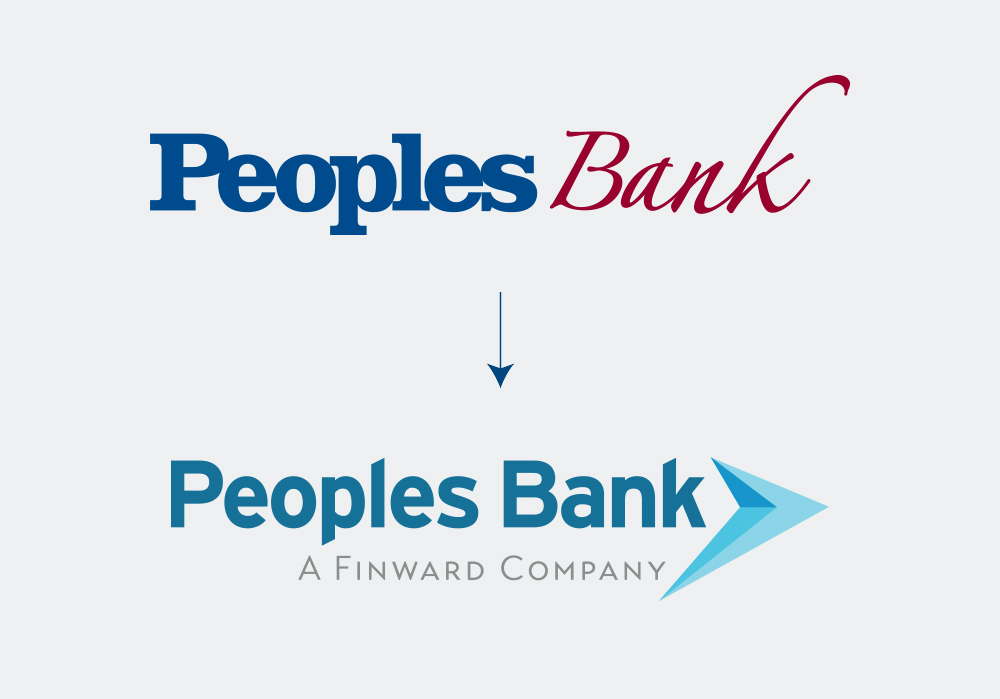
The Ask: To develop a refreshed brand that is new, and modern, with messaging that is an approachable statement of what Peoples has always stood for—supporting people not just where they are today, but also where they want to go in the future.
The Answer: Build a brand story that shows the forward-thinking nature of the new brand, and reinforces the qualities customers have always valued in the Peoples Bank brand through messaging, visually appealing design, and a new logo.
The Answer: Build a brand story that shows the forward-thinking nature of the new brand, and reinforces the qualities customers have always valued in the Peoples Bank brand through messaging, visually appealing design, and a new logo.
Process
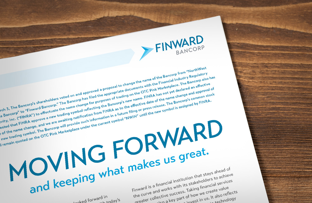
Having worked with Peoples Bank’s holding company, Finward Bancorp (formerly Northwest Indiana Bancorp), on a brand refresh earlier in the year, Pannos was ready to take Peoples Bank on a similar journey toward rethinking their brand to better align their goals with today’s industry needs. The process began with a series of in-depth discovery sessions between Pannos and Peoples Bank, digging into the strengths and values of Peoples Bank to identify a solid foundation for their new brand, leaving no stone unturned along the way.
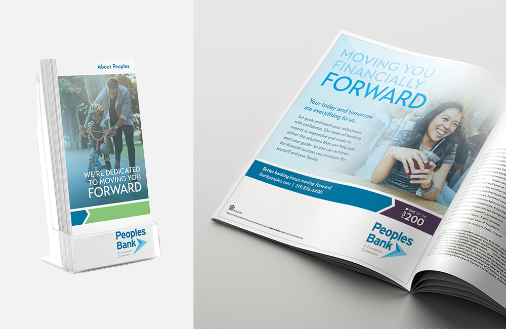
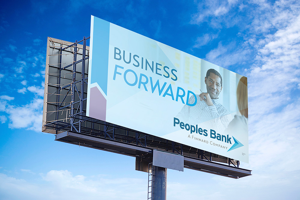
We identified the main values of Peoples Bank and leveraged their expertise, value in customer service, and responsiveness to form a new promise customers could count on—that Peoples Bank is the best partner to help you move your finances forward. Confident in the power of that message, we looked to the new Finward Bancorp logo and messaging to reinforce the strength and reliability of Peoples Bank in their outward messaging to their communities, current and prospective customers.
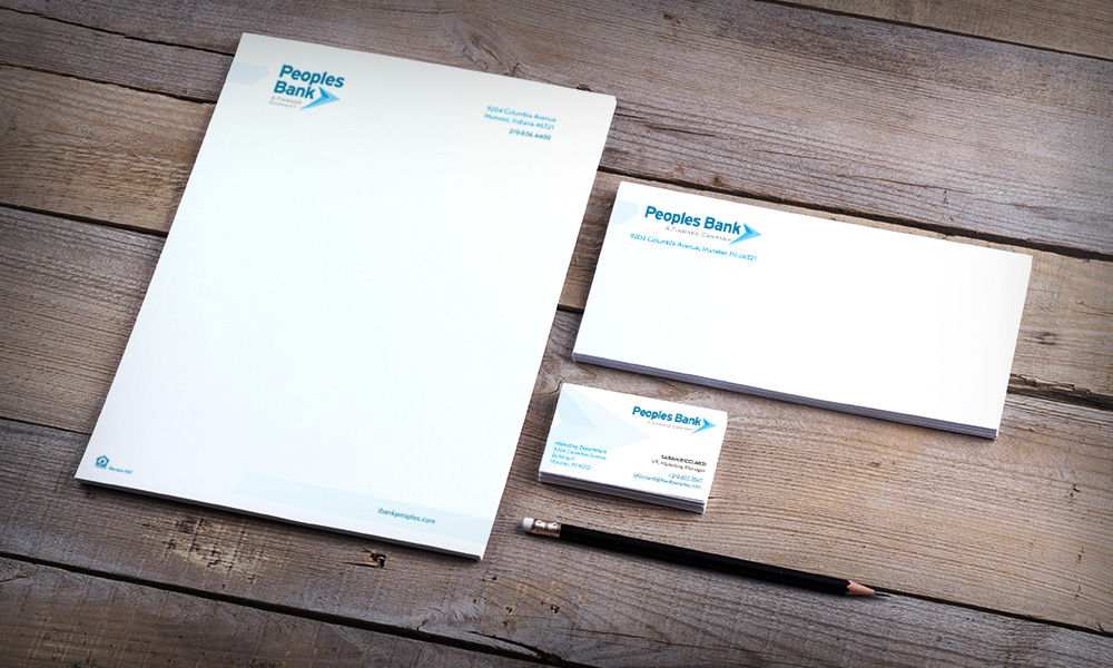
Through fresh and modern colors, we elevated the visual personality of Peoples Bank to meet their need to be more modern and accessible in their identity as a trusted financial partner. The new messaging and design came together to give their community something to rally around, that Peoples Bank is truly the best partner to help move your finances forward.
We identified the main values of Peoples Bank and leveraged their expertise, value in customer service, and responsiveness to form a new promise customers could count on—that Peoples Bank is the best partner to help you move your finances forward. Confident in the power of that message, we looked to the new Finward Bancorp logo and messaging to reinforce the strength and reliability of Peoples Bank in their outward messaging to their communities, current and prospective customers.
Through fresh and modern colors, we elevated the visual personality of Peoples Bank to meet their need to be more modern and accessible in their identity as a trusted financial partner. The new messaging and design came together to give their community something to rally around, that Peoples Bank is truly the best partner to help move your finances forward.
Results
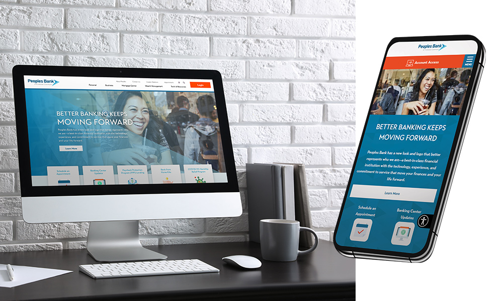
A modern, fresh, and original brand that sets Peoples Bank apart from their competitors as a trusted, personable and innovative financial partner who will always be there to offer solutions for todays and tomorrows financial challenges.
Like what you see?
We can do the same for you.