Overview
First National Bank of Hutchinson came to Pannos looking for a new website that had a modern look and feel, particularly one that could aid in attracting younger generations of customers. They wanted this website to serve as a focal point in their upcoming rebrand, and to celebrate their existing logo (which would be staying the same) to stay true to their Midwest feel and spirit.
Services used on this project
- web design
- content management
- online visibility
Project Goals
The Ask: Create a new website with a more modern look and feel whose purpose and launch would serve as a jumping-off point for their upcoming rebrand. Use various forms of content including video, imagery, and text to tell a story across the new website that celebrates the original FNB logo and stays true to their Midwest roots.
The Answer: Use images, video, and playful design to heighten the energy of the new website while cutting down on text to make the site more easily accessible and user-friendly. Utilize the website as inspiration for new marketing materials during the upcoming rebrand, rather than going the traditional route of launching a new website as a result of a rebrand.
The Answer: Use images, video, and playful design to heighten the energy of the new website while cutting down on text to make the site more easily accessible and user-friendly. Utilize the website as inspiration for new marketing materials during the upcoming rebrand, rather than going the traditional route of launching a new website as a result of a rebrand.
The Process
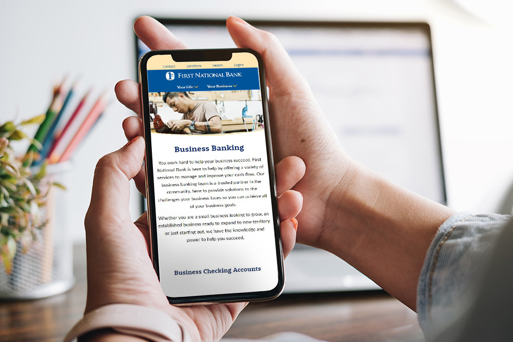
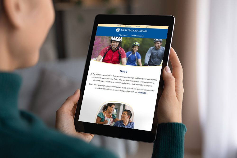
Pannos and First National Bank of Hutchinson started the new website process by holding in-depth discovery calls with individual teams at the bank; including the farm management team, retail department, business banking department, and more. We wanted to identify what was working on their current site, and what could be improved, to help make the user experience easier and more enjoyable. In doing so, we came up with various solutions to keep users engaged, such as a robust blog section, a lifestyle navigation for easier user-journey, and page-design that speaks to their logo and Midwestern roots.
The Results
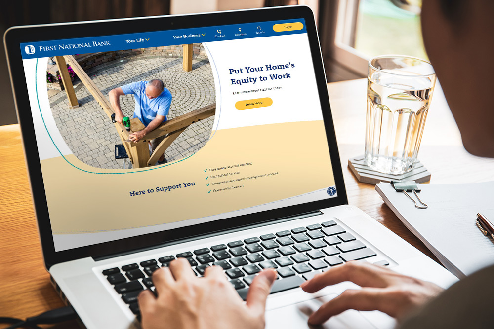
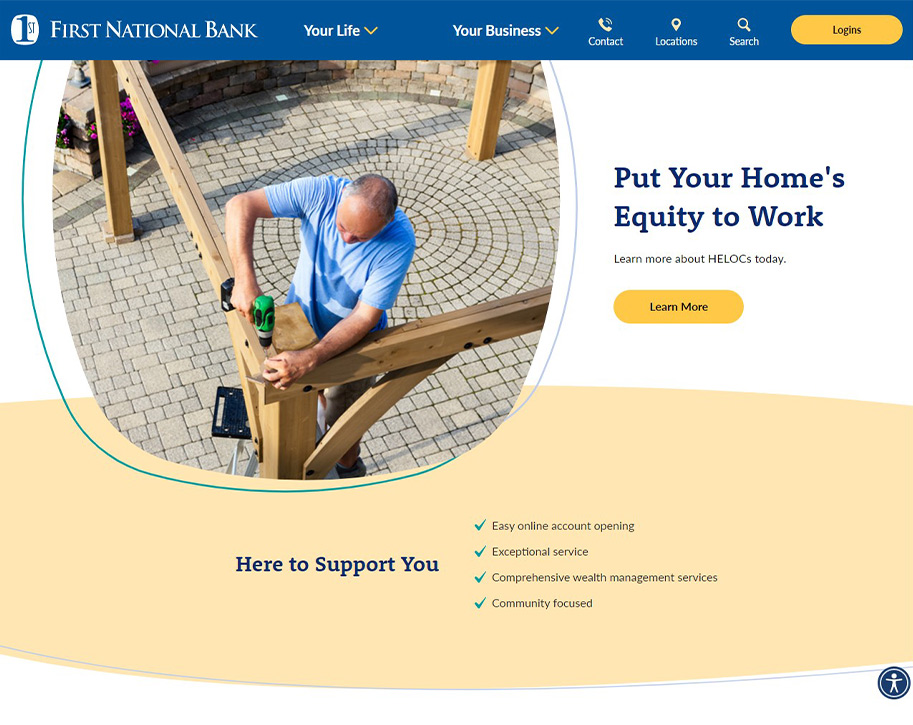
We created a modern site that is not only easy for users to navigate, but also easier for the bank to update and manage. Through imagery, videography, and modern design, we were able to deliver a site that looks and feels modern while still celebrating the Midwestern spirit of the original brand identity.
To see the transformation, slide the center arrows to reveal the old site on the left and the new site on the right.
To see the transformation, slide the center arrows to reveal the old site on the left and the new site on the right.
Like what you see?
We can do the same for you.