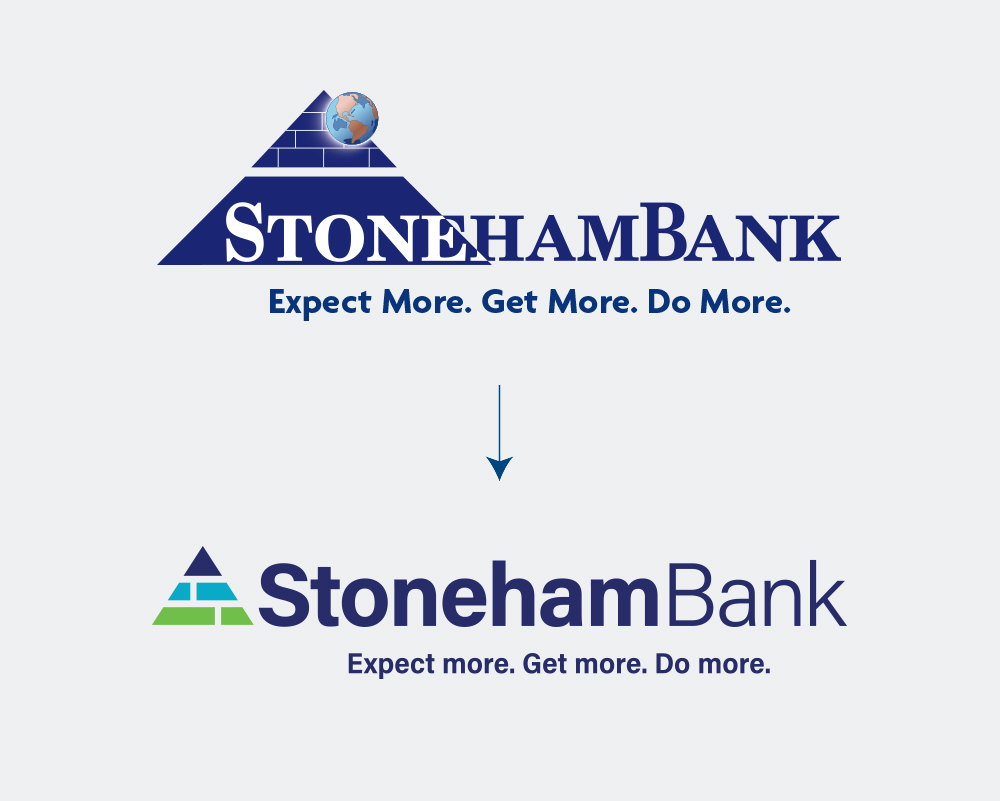
Logo Redesign
StonehamBank prides themselves on being more than a bank for their customers and their community. They are heavily involved in making positive changes throughout their community and wanted a new logo that resembled how hard they strive to be a forward-looking financial institution who fulfills the needs of the community through comprehensive financial services, technology, and support.
Project Goals
The bank wanted their new logo to celebrate the colors and vibrance of their community, using clean lines and simplicity to emphasize the strength of the pyramid that sat at the heart of their original logo.
The Process
Drawing on the colors in the StonehamBank community, we evolved the iconic StonehamBank pyramid into a simplified, modern, and colorful new logo that honors the past and aims for the future. Keeping the bricks in place—which represent StonehamBank’s history of building up the communities it serves—we added space between the blocks. Not only does this space make for clarity at smaller sizes, but these lines also represent the pathways connecting the community that StonehamBank is so proud to serve.


Like what you see?
We can do the same for you.