Logo Redesign
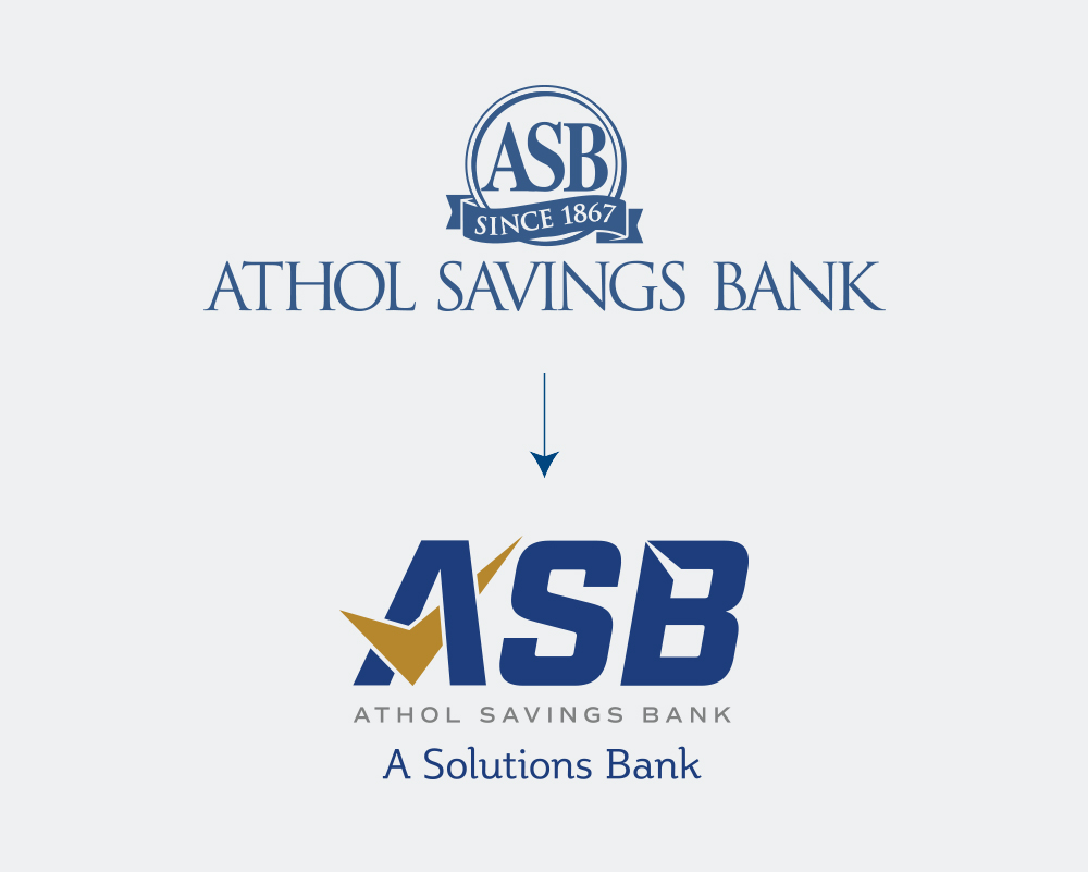
As a mutual savings bank, Athol Savings Bank has been serving their community since 1867 without the backing of shareholders. When they came to Pannos with the hopes of refreshing their brand, they wanted to contemporize their look, message and potentially their name to compete and grow in a modern market.
Project Goals
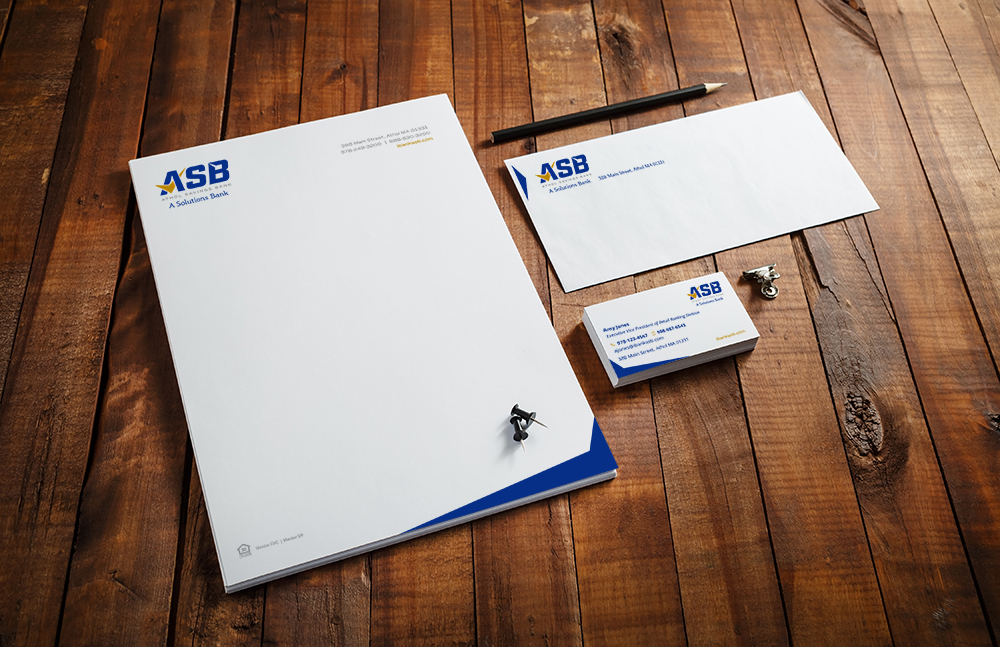
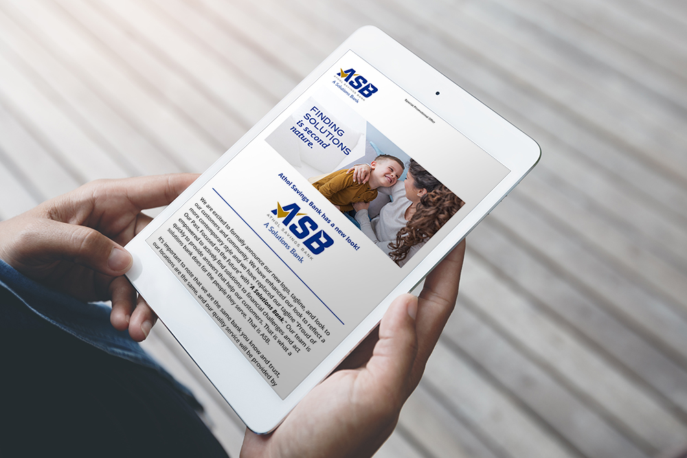
The bank wanted their new logo to convey a modern feel that spoke to their unwavering commitment to great customer service and ability to provide contemporary, personalized solutions to every customer and community they serve.
The process
Pannos worked to develop a shortened name and new tagline for Athol Savings Bank that would speak to their roots, and position them as a solutions-focused bank, now and in the future.
Like what you see?
We can do the same for you.