Since its inception, People's Credit Union has always been about "people helping people". The credit union believed its brand needed a refresh that would best articulate its strengths, personality attributes and commitment to its surrounding communities.
Services used on this project
- Branding
- Design
Project Goals
The Ask: To develop a refreshed brand that encapsulates everything the credit union stands for while continuing to evolve and capture the hearts and minds of their members and community, one that captures the personality and attributes that define them today and tomorrow.
The Answer: Build a brand messaging story that their existing members, prospective members, and community can rally behind, and one that employees can not only feel proud of and prove to the marketplace but carry with them day to day as a unified team.
The Answer: Build a brand messaging story that their existing members, prospective members, and community can rally behind, and one that employees can not only feel proud of and prove to the marketplace but carry with them day to day as a unified team.

Process
A non-traditional approach was taken in developing the new People's Credit Union brand because the project began at the start of the pandemic. Pannos held a series of in-depth Zoom discovery sessions to ensure no one's voice or thoughts were left out – and that People's Credit Union's true identity was captured. Collaboration and a genuine partnership evolved quickly as discussions uncovered the core values and strength that would eventually bring foundational clarity to the PCU brand. Following these meetings, the findings and a new look were presented. The new look showcased strong headlines and photos that were selected with diversity in mind, local scenery that represented the credit union's surrounding communities and the everyday lifestyle of their members. The new creative also focused on portrait-like photos that captured the emotional qualities of a moment-in-time, rather than a staged shot.
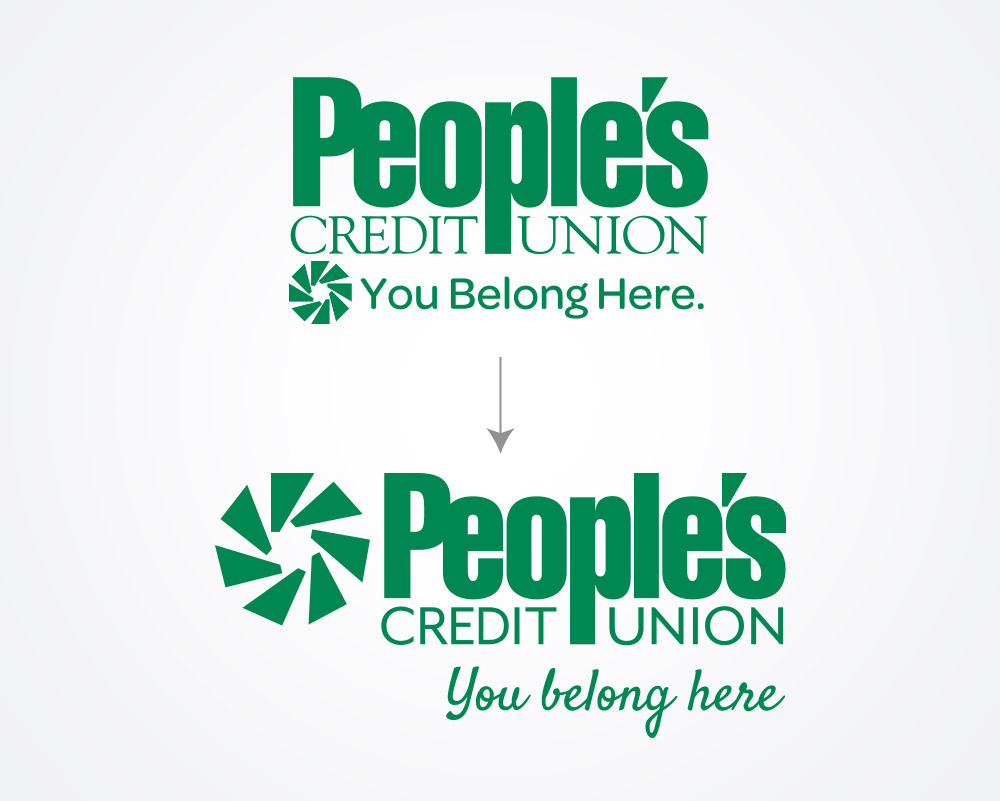
In addition to a new look, the Pannos team performed a logo exploration which sparked much conversation around the “wheel” element in the credit union's existing logo. Our goal was to elevate the "wheel" and the credit union's tagline "you belong here" in a more formal, meaningful way. After the exploration and many discussions between the credit union and Pannos, we later renamed the "wheel" element to the propeller. The propeller is a metaphor for continually moving forward as you navigate an ever-changing course. Look closely and you’ll see a ring of 7 apostrophes, each representing one of People's Credit Union's founders – underscoring the time-honored ideals that still guide the credit union today.
The credit union strongly believes that their employees are key to bringing the brand to life, and having employees be part of the revitalized brand journey would be crucial to the future success of the brand. Collectively, our efforts built the brand framework personifying what People’s Credit Union stands for, authentically. As quoted by their head of Marketing, “We now have powerful brand personality words we did not have before. The words have been embraced by the organization as a whole, and we're now looking at things through this lens."
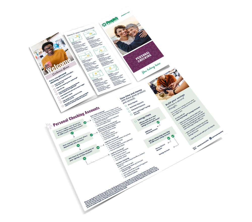
The credit union and Pannos worked closely to develop a series of materials that were leveraged internally throughout the organization to ensure the new look, voice, and spirit of the credit union were brought to light.
In addition to a new look, the Pannos team performed a logo exploration which sparked much conversation around the “wheel” element in the credit union's existing logo. Our goal was to elevate the "wheel" and the credit union's tagline "you belong here" in a more formal, meaningful way. After the exploration and many discussions between the credit union and Pannos, we later renamed the "wheel" element to the propeller. The propeller is a metaphor for continually moving forward as you navigate an ever-changing course. Look closely and you’ll see a ring of 7 apostrophes, each representing one of People's Credit Union's founders – underscoring the time-honored ideals that still guide the credit union today.
The credit union strongly believes that their employees are key to bringing the brand to life, and having employees be part of the revitalized brand journey would be crucial to the future success of the brand. Collectively, our efforts built the brand framework personifying what People’s Credit Union stands for, authentically. As quoted by their head of Marketing, “We now have powerful brand personality words we did not have before. The words have been embraced by the organization as a whole, and we're now looking at things through this lens."
The credit union and Pannos worked closely to develop a series of materials that were leveraged internally throughout the organization to ensure the new look, voice, and spirit of the credit union were brought to light.

Next Steps
With an established direction, we are beginning to roll out the new brand across all avenues and measure its ultimate success throughout the market. The goal is to raise awareness of the People’s Credit Union value proposition and brand promise and to show what People's Credit Union stands for. Brand videos will set the stage for the brand launch and set the theme for communications moving forward.
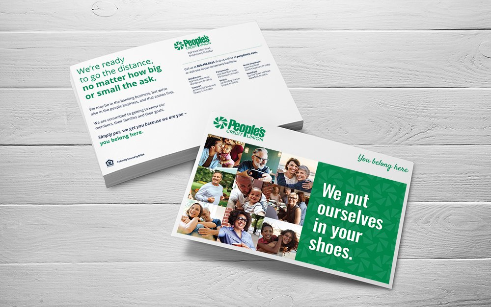
The objective will be to convince members and prospective members that when you (join) become a member of People's Credit Union you are part of something different (bigger). It is not about accounts, loans and transactions. It's about engaged relationships - that People’s Credit Union understands them and relates to their needs, and as a community member too, is committed to working personally beside them, no matter how big or small the ask. Because, simply, they always put themselves in their shoes – they belong here.
Once the theme is set, subsequent communications will deliver on the proof points. The goal isn't to communicate all the proof point in one message, but rather to consistently sustain the messaging into the future and add dimension over time.

Like what you see?
We can do the same for you.