Peoples Bank, a community bank located in the very rural Altenburg, Missouri, turned to Pannos when they felt like they were beginning to outgrow their brand. With a new branch set to open in just a few months and the pressure to modernize looming, Peoples Bank knew it was time to rebrand. With a unique customer base made up of people off the grid, farmers, and their families, this would require some expert creativity.
The Pannos team pulled themselves up by bootstraps to ensure that the Peoples Bank brand would grow and adapt to fit their new digs without forgetting its roots.
The Pannos team pulled themselves up by bootstraps to ensure that the Peoples Bank brand would grow and adapt to fit their new digs without forgetting its roots.
Services used on this project
- Branding
- Design
- Copywriting
project goals
The Ask: Develop, create, and implement a brand that would resonate with the bank’s unique customer base and draw in new ones as it grows.
The Answer: A confident new brand that recognized the importance of the bank’s roots while placing emphasis on the future and the goals of its customers.
The Answer: A confident new brand that recognized the importance of the bank’s roots while placing emphasis on the future and the goals of its customers.
Process
The Pannos team kicked off this rebrand process by hosting several discovery sessions with Peoples Bank team members in all roles and all levels of seniority. The deeper into the discovery we got, the more it became clear, we had struck branding gold; The Peoples Bank team doesn’t just know their customers, they are their customers – A theme that would drive the rebrand.
The discovery sessions also uncovered that the bank would be opening a new branch in the current months and wanted to position themselves as the “go-to” for generations to come.
With a treasure trove of information and personality and the green light from the Peoples Bank team, we got to work. The creative team began developing a brand story, personality, and core values that proudly let customers know “We are one of you”, a bold statement, but one Peoples Bank could truly back up.
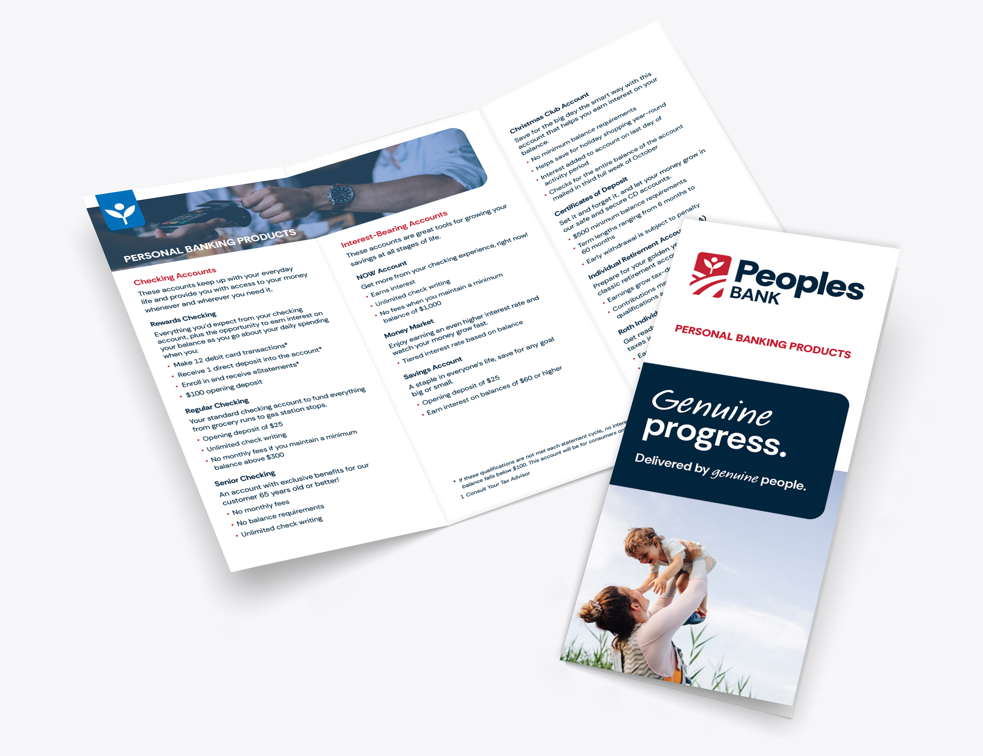
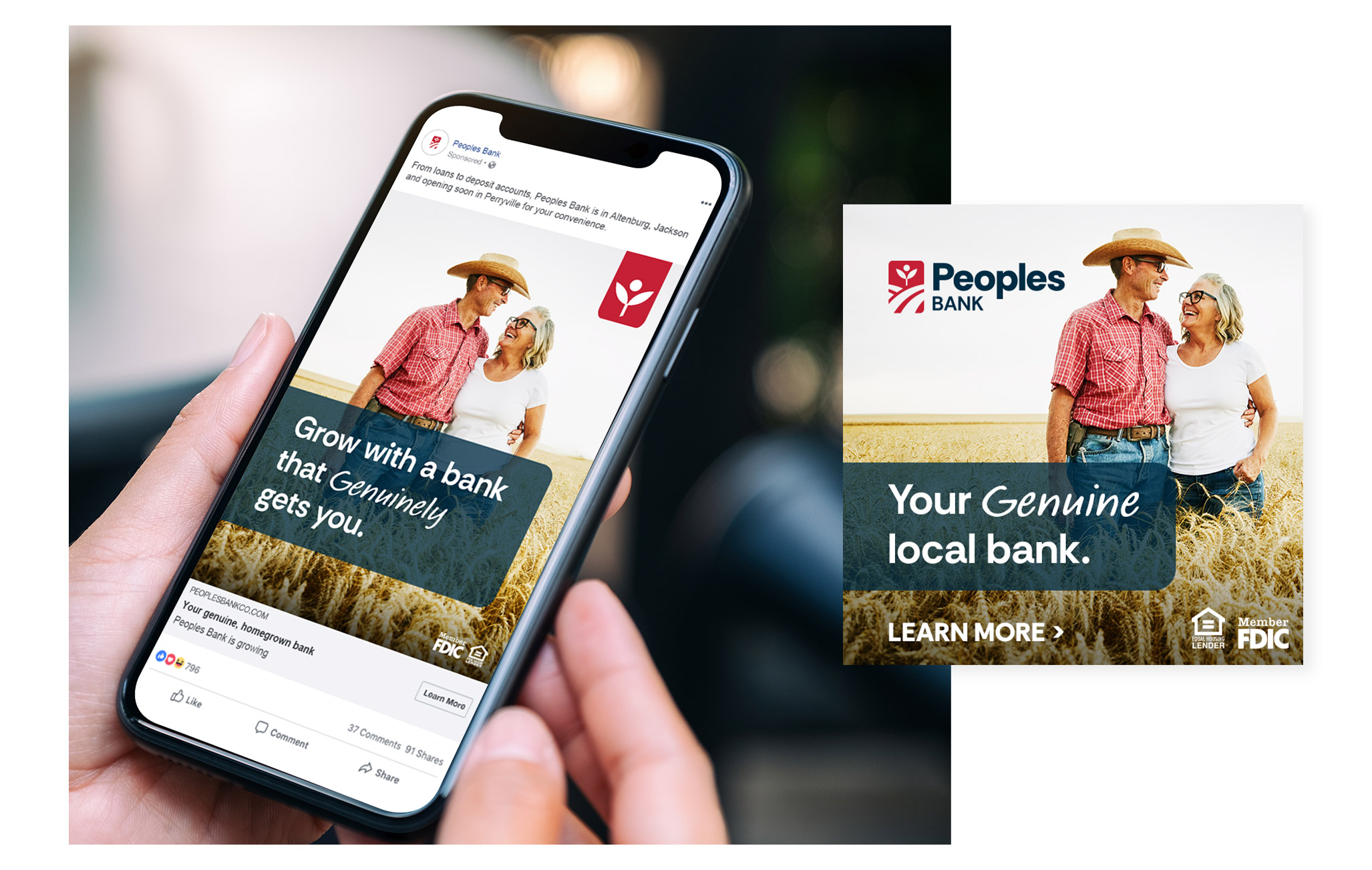
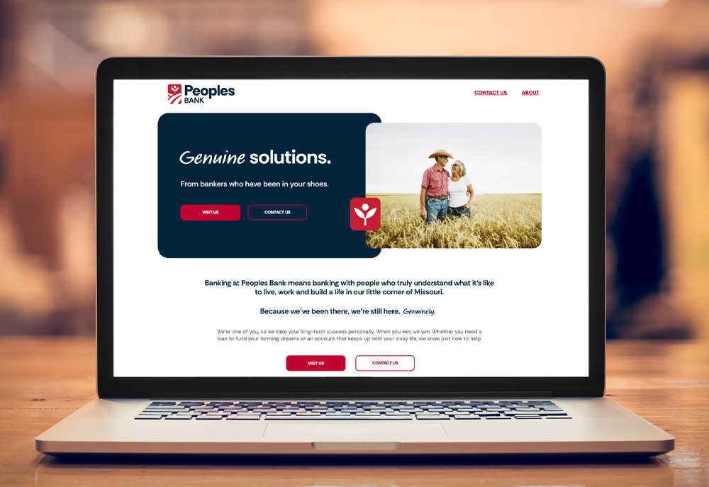
The new brand look and messaging were built around the word “Genuine” because Peoples Bank has proven everyone on the team is exactly who they claim to be. They have a farmer’s soul and a banker’s mind; they are people who grew up on farms, kids raised at 4H, and farmers turned bankers who are up at dawn and home at dusk to tend to a farm of their own. They know the unique struggles their customers face because they have been there too.
The discovery sessions also uncovered that the bank would be opening a new branch in the current months and wanted to position themselves as the “go-to” for generations to come.
With a treasure trove of information and personality and the green light from the Peoples Bank team, we got to work. The creative team began developing a brand story, personality, and core values that proudly let customers know “We are one of you”, a bold statement, but one Peoples Bank could truly back up.
The new brand look and messaging were built around the word “Genuine” because Peoples Bank has proven everyone on the team is exactly who they claim to be. They have a farmer’s soul and a banker’s mind; they are people who grew up on farms, kids raised at 4H, and farmers turned bankers who are up at dawn and home at dusk to tend to a farm of their own. They know the unique struggles their customers face because they have been there too.
Results
A new, confident, and relatable brand that has its roots in farming and its eyes on all things banking, and a huge positive response from the audience.
The new brand emphasizes the bank’s transparency and truthfulness. It’s honest and straightforward and highlights the bank’s confidence in its identity as an institution made up of farmers with bankers’ minds.
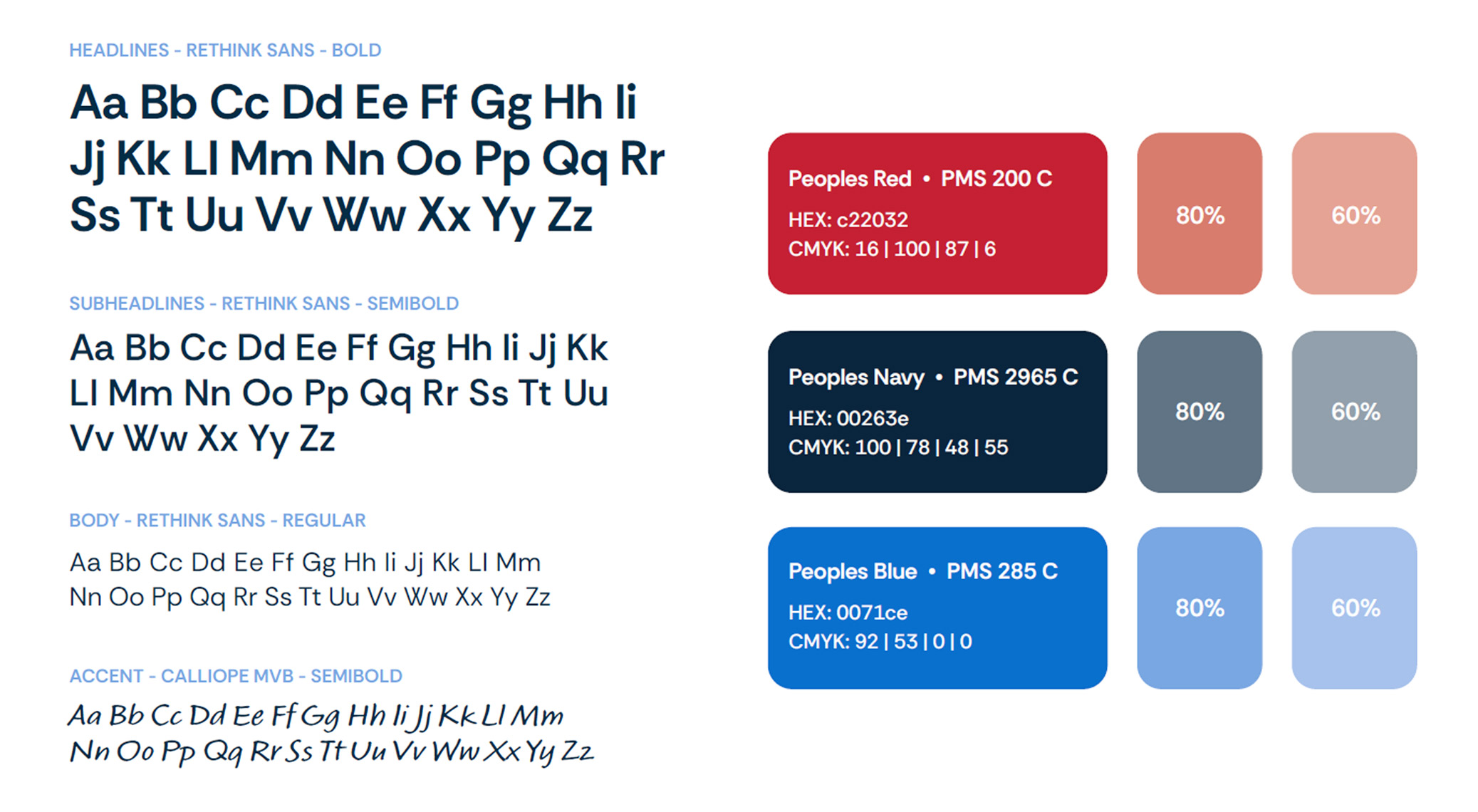
The new iconography is playful and borrows the plant and rolling hills visuals from the logo. Photography feels authentic and true to the Peoples Bank brand, and the strong connection the bank has to the community.
This modernized take on the Peoples Bank brand is sure to keep their current customers close and new one’s flocking to see who the farmers-turned-bankers truly are.
The new brand emphasizes the bank’s transparency and truthfulness. It’s honest and straightforward and highlights the bank’s confidence in its identity as an institution made up of farmers with bankers’ minds.
The new iconography is playful and borrows the plant and rolling hills visuals from the logo. Photography feels authentic and true to the Peoples Bank brand, and the strong connection the bank has to the community.
This modernized take on the Peoples Bank brand is sure to keep their current customers close and new one’s flocking to see who the farmers-turned-bankers truly are.
Like what you see?
We can do the same for you.