Overview
With the recent Athol Savings Bank logo and branding refresh entering the market, ASB wanted to reinforce their new identity and evolve it to reflect the bank's commitment to the area, poising it for future growth. The redesigned logo changed the meaning of the letters ASB to stand not only for Athol Savings Bank but also “A Solutions Bank” which drove our process and direction.
Services used on this project
- Web Design
- Content Management
- Hosting
- SEO
- Analytics
- Online Visibility
Let the numbers tell the story
74%
increase in overall users
106%
increase in new users
45%
increase in pageviews
Project Goals
The Ask: Develop a website that functions as another branch, as well as reflects the brand and voice of the institution.
The Answer: Create an engaging website that showcases their redesigned logo and accurately conveys the refreshed brand. Here’s how we made that happen.
The Answer: Create an engaging website that showcases their redesigned logo and accurately conveys the refreshed brand. Here’s how we made that happen.
The Process
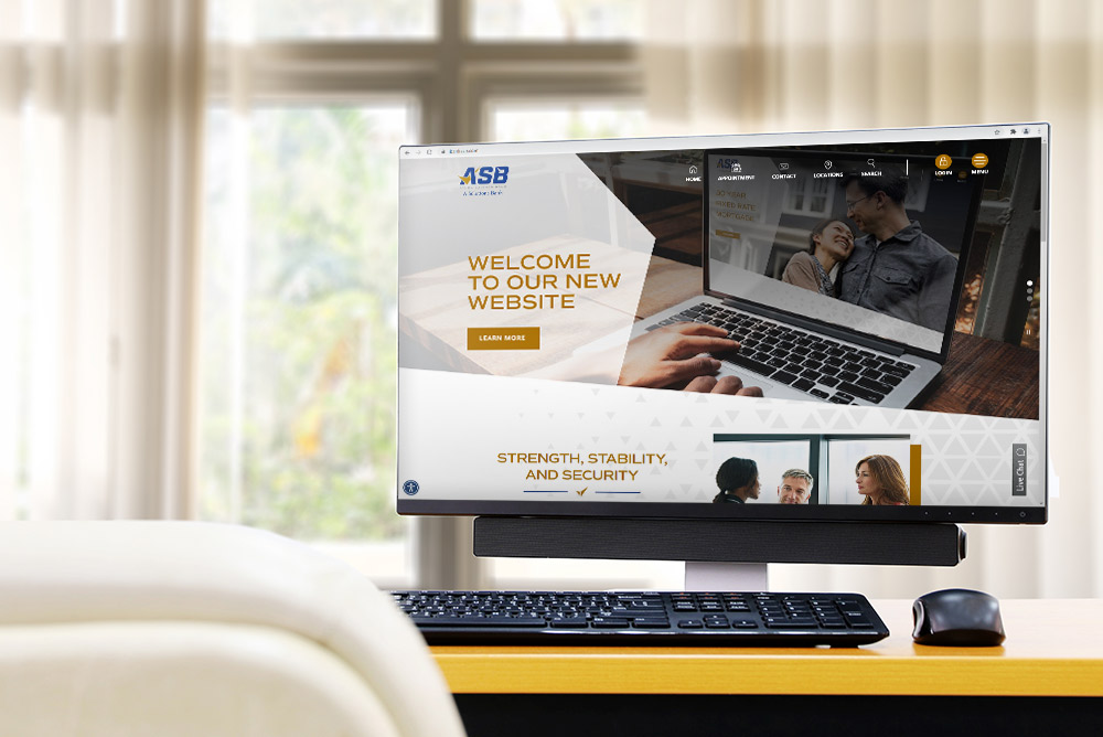
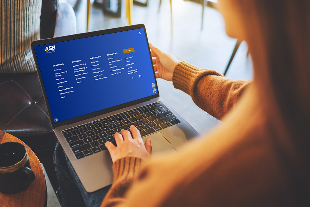
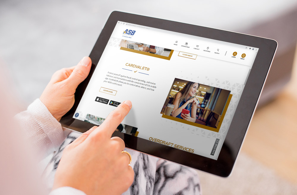
We started the process by holding in-depth discovery sessions with the bank. Armed with the insights gained during discovery, we collaborated to craft a streamlined user experience made to reflect the brand direction. Taking a slightly different approach, we went with a full screen menu to eliminate the clutter and noise. We also used geometric shapes and diagonal breaks to create a clean, modern design. Most importantly, the site was built mobile-first, ensuring that users would have a seamless experience regardless of their device.

Results
An engaging, colorful website that builds on the bank’s refreshed brand and logo. The new website leverages SEO best practices, with a full tagging strategy in place to ensure the new site is just as measurable as their brick-and-mortar branches.
Like what you see?
We can do the same for you.